‘Dental website science’ (a.k.a – the science behind a dental website) is probably something you’ve never given much thought. Ever thought about why advertising companies love the colour red? Or why people pair red with green? Probably not.
It turns out, however, that there is a method behind everything from colour combinations, to the position of a button asking you to sign up to a newsletter.
If you want your dental practice to have the best possible website, then considering the science behind it might be what takes your website from average to exceptional.
Leads can increase dramatically when you focus your efforts on persuasion that is backed by research. When users take, on average, 3 seconds to continue browsing through your website – you need to catch their attention.
Find out 13 ways to keep potential patients on your dental website below.
1) The psychology of colour
The connotations of colour can be a big influence on website design. Consider the fact that blues, greys and whites are paired together as they are more cool-toned. Reds, oranges and browns are warm-toned. This alone can influence how a user may feel when they view pages on your website.
Don’t underestimate the power of colours. Did you know that weightlifters are, according to studies, able to lift heavier weights in blue gym rooms? As a result, gyms are often painted shades of blue.
Think about what specific colours evoke when you choose them for your website, and work backwards from there.
2) Complementary colours
Complementary colours can be used to great effect in dental websites. Red and green, blue and orange and purple and yellow are complementary colours as they are opposites on the colour wheel. Using these complementary colours together can make them appear brighter, drawing the eye in more effectively.
If you were to pair a red ‘Call to action’ button (a button persuading a user to take a specific action, such as signing up to a newsletter), with a green background, potential patients’ eyes would immediately be drawn in to the call to action button.
You don’t have to go wild with complementary colours though, small doses are arguably more effective!
3) The ‘visual hierarchy’
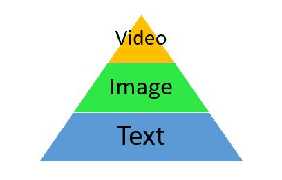
Large beats small, top of the page beats the bottom of the page. If you want certain aspects of your website to be more prominent, then the position is extremely important. Video tends to be more effective than text, the same way components of your page will be brought to the forefront by having entirely blank space behind the information.
Remember what we said about colour? High contrast colour combinations (such as complementary colours) have high visual prominence.
Think about what your brand message is and bring it to prominence by keeping in mind the visual hierarchy.
4) Be above the fold
What is the website fold, you say? When potential patients access your website, there is a certain amount of content they can see without having to scroll down on your page. It is this area that is vital, as it is the pivotal point at which patients decide if they want to scroll down your page or abandon it.
Making sure all information ‘above the fold’ is compelling enough to encourage further interaction from users is instrumental in making them view all you have to offer, rather than leave your webpage because they see a paragraph of complicated information that continues below the fold.
5) Call to action where it counts
You want potential patients to sign up to a newsletter? Book an appointment? Call for a free consultation? Your call to action buttons will prompt these actions, but be careful where you put them.
Whilst the most prominent information on your page should be above the fold, a call to action button can be made redundant by being so high on your page.
It takes time to persuade patients into taking an action, which means you need more space to do so. Making sure you have more than one call to action button can be helpful, specifically after additional pieces of information that might cause them to click.
Make sure you give them time to come to a decision, so they have all the information they need.
6) Keep it clean and simple
Google carried out a study in which they assessed the effectiveness of low-complexity versus high-complexity websites. Unsurprisingly, websites that are simple, uncluttered and minimalist tend to be more favourable.
Nobody wants to click on your website only to be met with a catastrophe of information, videos and clashing colours. Information is easier to process when it is presented without excessive additions.
That doesn’t have to mean boring, it just means that you should focus on a few elements at a time, rather than putting every possible option in one space.
(Plus, less complex designs are seen as more beautiful…)
7) Think outside of the box, but keep it square
Not having a visually complex website doesn’t equal boring and tedious. You can have effective colour-schemes with a simple layout. We are creatures of habit, which means seeing a website design that is completely the opposite to what we regularly see can have a negative impact.
You can be different in what you offer your patients, rather than how your offers are presented.
Standard elements include a top left header, with a navigation bar in the header. Social media icons tend to be at the footer of the page, rather than at the top.
8) Put your best face forward
Face related imagery is considered the most powerful imagery, as it can draw attention and persuade effectively.
The chances are that potential patients want to see you, your dental team and happy customers. Face related imagery can be used to show your practice off, which increases trustworthiness. It can also be used to showcase patient testimonials, which will increase the chances of potential patients becoming actual patients.
Faces make you seem more personable to people on your website, creating a stronger connection than a faceless brand would.
(For the love of God, don’t use stock images of people, though!)
9) Avoid distractions on your homepage
Getting distracted is easy, and it happens to the best of us. Your potential patients want a streamlined experience, which you should provide if you want to increase the number of patients you have.
Putting social media icons, external links or links to blog posts on your homepage is a definite way to get visitors so distracted they might never come back onto your homepage.
By minimising their options to avoid your calls to action and information, you are ensuring they go through the process you have created for them, resulting in an action being taken.
10) Make it meaningful
When has being vague helped anyone?
If someone has clicked on your website, the chances are that they are hungry for information. How you give it to them will be the difference between a successful transaction and them clicking off your page, never to return.
How many times have you been looking for information, only to be faced with subheadings such as ‘What we do’, and ‘Our services’?
Wouldn’t it be better to say ‘The Dental Team @ (your dental practice name)’, or ‘Cosmetic Dentistry Services’?
11) Don’t get stuck in the middle
On average, user retention of information is at its lowest in the middle of a list, in comparison to the beginning and the end. What is likely to stick with visitors is the beginning and the end of any information on your website, so put the most valuable information there.
Valuable information sticking in a visitor’s short-term memory is a useful way to get them to search for further information on your website, rather than leave it.
12) Conformity bias
Adding testimonials gives your website validity to visitors, making you seem like a reliable choice for them. When making decisions, we all want strong evidence to ensure we’re making the best possible decision. Helping visitors choose you by providing this evidence makes their experience more painless.
Has your dental practice received any awards or special mentions by specific awarding bodies/media/associations?
We all love a good logo, certification or award. We don’t want to spend a lifetime deciding if your dental practice is good, we want you to tell us that you are with evidence. Dental website science is all about making the process as simple as possible.
Reducing the amount of time it takes a visitor to make a decision is inevitably going to have a more positive effect than making them search elsewhere for additional information will.
13) Cost/benefit analysis
As it turns out, our decision-making skills are skewed by a tendency to focus on losses more than gains. This is called ‘loss aversion’, a psychological phenomenon whereby we are more likely to react strongly to a perceived loss than we are to a perceived gain.
What will potential patients risk by not choosing your practice? Before and after pictures are a great way to show the benefits of your service, but also highlight what the ‘loss’ was before a patient chose your services.
It’s not science, it’s dental website science!
14) Create a sense of urgency
We don’t like feeling like we’ve missed out.
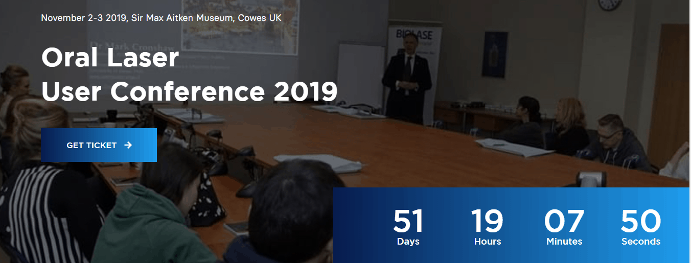
Take this website we designed here at The Creative Composite, for example. Adding in a time-limit for an offer will urge people towards taking action, whether they realise it or not. Think about it; are you more likely to click on something you know will be there forever, or something that is limited?
Adding in countdown options and progress bars will create a sense of urgency, pushing visitors into acting before they have time to decide not to. Limiting the ability for visitors to click off your page is one of the most effective steps towards gaining business from them.
Conclusion
Long story short, people want their journey on your dental website to be as simple as possible. By making all vital information easily accessible, call to actions prominent and decision making as painless and easy as possible, you will create a better user-experience.
Dental website science takes the confusion and time-consuming process of decision-making out of potential patients’ hands, leading them directly to the action you want them to take most.
It’s not hypnosis, but it’s pretty close.
Want to know 8 secret SEO tips that bring new patients?


